Color Guide to Success
December 4th, 2013 by admin
 When a designer generates graphics on a computer for printing, or wishes to print images from a digital camera, it is a common mistake to assume that the colors seen on the screen will look the same in print. As a result, files for printing are often erroneously sent in the Red-Green-Blue (RGB) format for printing. The issue lies in the fact that the computer screen and many photo editing programs show colors in RGB mode, while images are printed on paper in Cyan-Magenta-Yellow-Black (CMYK) format. In many cases, there will be noticeable differences between the shades of color. The key to avoiding this potential problem is to convert all graphics to CMYK format during the layout design phase.
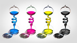
CMYK: The Formula for Success
Full-color printing, also called “4-color process” uses Cyan [C], Magenta [M], Yellow [Y], and Black [Y] in different percentage combinations to create the colors we see in print. By specifying your design elements using CMYK , you can be confident that you will get the colors you want. Create your design in CMYK color instead of RGB whenever possible.
RGB.
A common color mode, RGB stands for the colors of Red, Green, Blue. Add red, green, and blue light to create white light. Because you ADD the colors together to get White, we call these RGB colors the additive primaries. Colors on screen are displayed by mixing varying amounts of red, green, and blue light.
Working with images destined for the screen or the Web, we designate colors by the amount of red, green, or blue in the color. In your graphics software these numbers might look like this: 255 RED 255 GREEN 0 BLUE. A number between 1-255 designates the amount of each RGB color.
Keep in mind that RGB refers to an on-screen color mode. Mixing red, green, and blue inks or red, green, and blue paints is not going produce white.
Spot Color or 4-Color.
Spot colors use ink that is custom mixed. Generally, spot color is used with 1- or 2-color printing. Inks like fluorescent orange, metallic gold or Pantone colors are examples of spot color.
For more color choices at a lower cost, use CMYK color in your design. Full-color photos are always printed in CMYK
Black and Rich Black.
Black colors in print are not all the same. On computer monitors, all blacks will generally appear consistent. But on press, different ink combinations can create a wide range of blacks.
When black is the text color, use flat 100% black (0-0-0-100) for the crispest result.
If you have a solid black area larger than two square inches, we recommend using a “rich black” for a darker, more inform color.
Leave a Reply