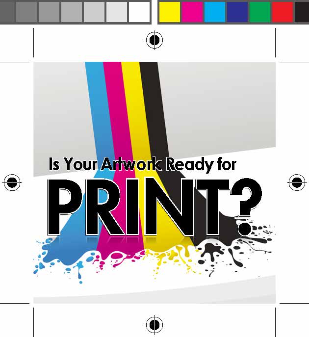
Get Your Design Ready for PRINT!
January 5th, 2015 by admin
Start off the new year on the right foot!
It is incredibly frustrating to spend hours and hours designing your work, only to send it to the printer and get back something far less than what you had envisioned. These last-minute problems do more than increase your stress levels and blood pressure, they’re actually very damaging to your productivity, and can be real problems for your bottom line.
So in order to smoothly transition from the design stage to printing, what processes should you put in place to avoid expensive (both in terms of finances and sanity) mistakes? It’s essential that you thoroughly proof your documents before going to the printers. Everything needs to be perfect, saving you time, money, and reputation.
Here are some simple guidelines to follow:
Proper Resolution
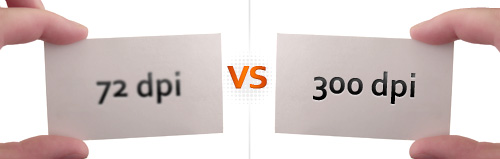
When you’re designing for web, your images are usually 72 dpi (Dots Per Inch), which is standard for screen resolution. For most print projects, you’re going to need more than 4 times that resolution -> 300 dpi. If you try and print your files at 72 dpi you will end up with blurry, fuzzy pictures, and you always want the highest quality for your clients.
RGB, CMYK, 100K Black & Rich Black
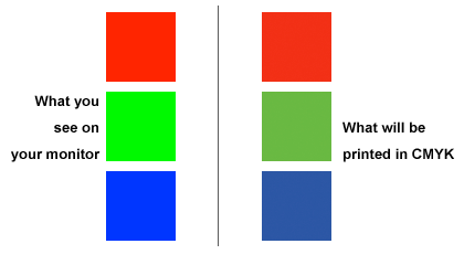
As you probably learned very early on, every color in the rainbow is created with a mixture of cyan, magenta, yellow, and black. To avoid costly color correction, convert your document from RGB to CMYK. Despite seeing no differences on screen, the printing difference is dramatic. It’s a small tip like this that can literally make or break your design, and save you a pretty penny at the same time!
To create Rich Black, you can use a mixture of 60% Cyan, 40% Magenta, 40% Yellow and 100% Black. Rich Black is best used for larger areas of black, and not on thin lines or text (text over 34 or 36pt is OK). If you use it on small body text or thin lines, the inks could saturate and blur the artwork.
100K Black is created using, you guessed it, a mixture of 0% Cyan, Magenta and Yellow, with 100% Black. For large areas, 100K Black would just look gray. For small text, it helps keep the text crisp since the printer only has to worry about lining up one color instead of four.
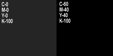
100% Black -> left / Rich Black -> right
Fonts
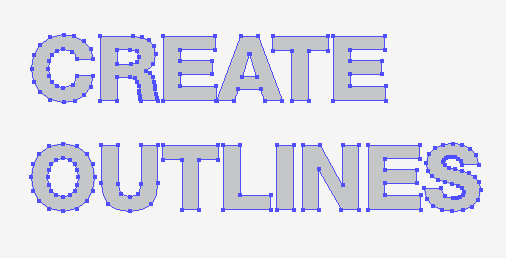
When your text is created in Photoshop or Illustrator, we recommend that you outline it before you send it to print. You will not be able to edit the text after you have flattened it, it does ensure that there are no issues related to missing fonts when we go to print your file and that the text displays correctly. In Illustrator and InDesign, this action is called “Create Outlines,” and in Photoshop it is called “Rasterize Type.”
Print Formats
Your best bet when sending your artwork to your printer, is a print ready PDF. Keep in mind that PDF files are harder for your printer to change, so if there is something missing it is more likely that your file will be sent back to you to make the changes. You may want to include the “working file” so if there is any chance you may have forgotten a critical print component, your printer can take it from there.
What else?
There are many factors which must be considered before sending your documents to the printer. Make a list of pre-flight guidelines to keep near your computer. Printing perfection can be achieved with pre-flight care. What other tips would you add to list?
Click here for more FILE PREP tips.
If you have additional questions about print-ready files, give one of our Print-Experts a call 800.443.2845
We know printing concepts can sometimes be confusing, but we are always here to help you through the print process!
#PrintReadyPDF, #WorkingFiles, #InDesign, #Illustrator, #Photoshop, #PrePress, #PreFlight, #PrintReadyFiles, #PrintTips
Leave a Reply